Crafting digital experiences that captivate and inspire since the year 2K.

Ecommerce Equifax IDV
I may have overdone it with the hero image—but while there’s no rectal scanning involved, the Equifax Identity Verification (IDV) is robust. Designed to enhance security, reduce fraud, and streamline onboarding, the product had a small issue: data showed that users were confused about how to properly capture their identity information. This issue caused a hiccup for our E-commerce product that used the IDV process to capture licenses.
I led a redesign focused on simplifying the onboarding experience by grounding solutions in real user pain points. I presented the findings to Equifax, who agreed with the approach and ultimately implemented a version of my solution.
Role(s)
- UX/UI
- Strategy
Year(s)
2025
Problem discovery: How might we reduce user error during the IDV process?
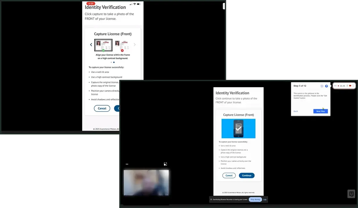
Data revealed two issues that users were running into while capturing their driver's license during the IDV process. 1) Users were having issues with identifying the parameters for the proper placement for their license and 2) Some users were capturing a photocopy of their license instead of capturing their original license. I had a hypothesis on how we would reduce user error during this process and needed to validate it.
Original Equifax IDV process for customers

Understanding the pain points and validating the hypothesis through user testing.
I led a comparative study of two onboarding flows codenamed 'Rose' and 'Sunflower' through unmoderated testing with 21 recruited participants. The study focused on users aged 25–65 across various income brackets to ensure a broad representative sample. By simulating the Equifax IDV license capture process, I gathered qualitative insights and quantitative data to identify precisely where and why users were experiencing friction.
Whether through A/B testing, usability studies, or other methods, putting ideas in front of users transforms opinion into evidence.
Test 1 – Rose
For the Rose test, majority of users were able to recall the best practices around capturing their photo on a high contrast background and positioning the camera directly over the license.
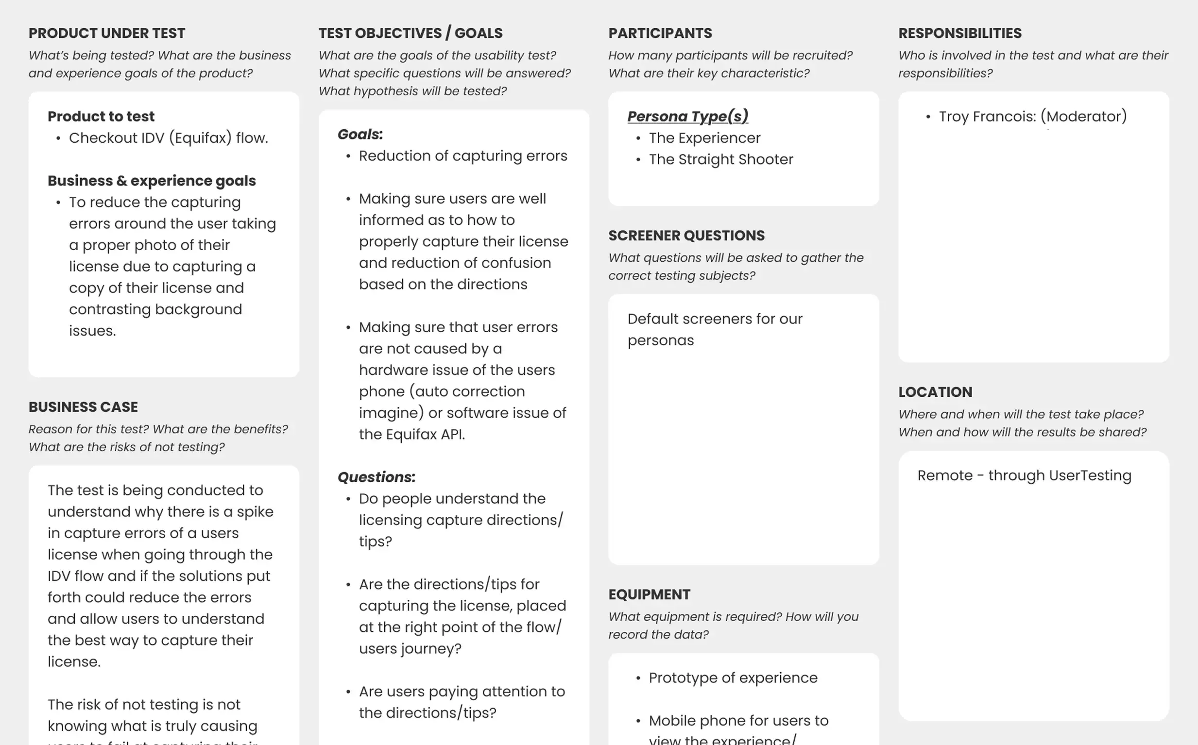
Test 2 – Sunflower
For the Sunflower test, the majority of users were able to recall the best practices around taking a photo of their original license and taking a photo of their license on a high contrast background.
Finding the stories hidden in the data and turning that data into direction.
Key behavioral insights revealed that users consistently remembered positioning the camera directly ove the license on a high-contrast background and the need to capture their original license and not a copy. This put Test 2, the Sunflower concept as the winner. Even though the animation from Test 1 (Rose) stood out, it wasn't universally understood; while it drew attention, its instructional intent wasn't always decoded correctly.
User testing research review and synthesis
Key Points & Takeaways
Users found the Sunflower solution to be the most helpful and informative. Users were able to recall the most important pieces of the capturing directions — capturing their original license and aligning their license properly. Confusion around the process was greatly reduced.